Shiny App
Welcome to our R Shiny App

The R Shiny application aims to help user explore the data provided by MC3 of the VAST Challenge 2024.
The Shiny App can be accessed on Shiny.io here.
You can find the user guide below.
Shiny App User Guide
Due to the amount of data being loaded, the app may take a few minutes to load the first time it is being accessed.
To download any graph of interest, right click on the graph to reveal the “Save Image as” or “Copy Image” dropdown.
Interface
The app is made up of 2 panels.
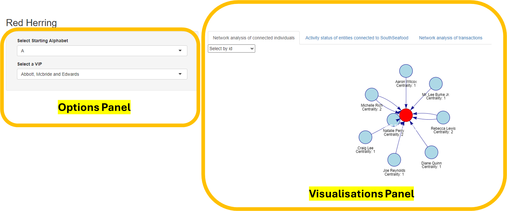
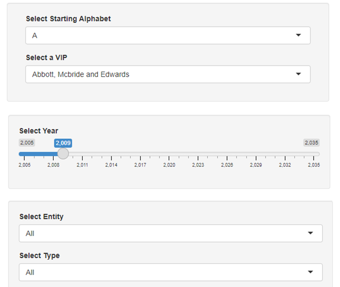
On the left is the options panel where various options can be selected to interact with available data for visualisation. In this panel, you will find either a drop down list or a slider for you to make your preferred selection.
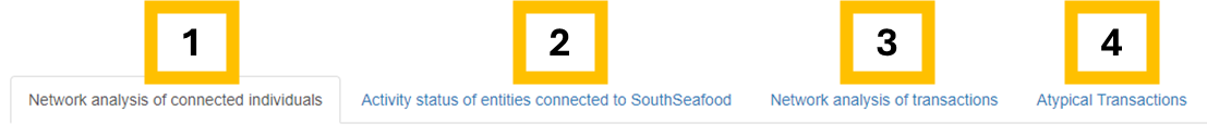
On the right is the visualisation panel with 4 tabs for data exploration. Visualisations are also plotted here.
Network analysis of connected individuals
Activity status of entities connected to SouthSeafood
Network analysis of transactions
Atypical Transactions
Network Analysis of Connected Individuals
This page shows the nodes of interest, the nodes that they are linked to, as well as the centrality between the nodes. Arrows are also shown in order to more clearly define the relationship.
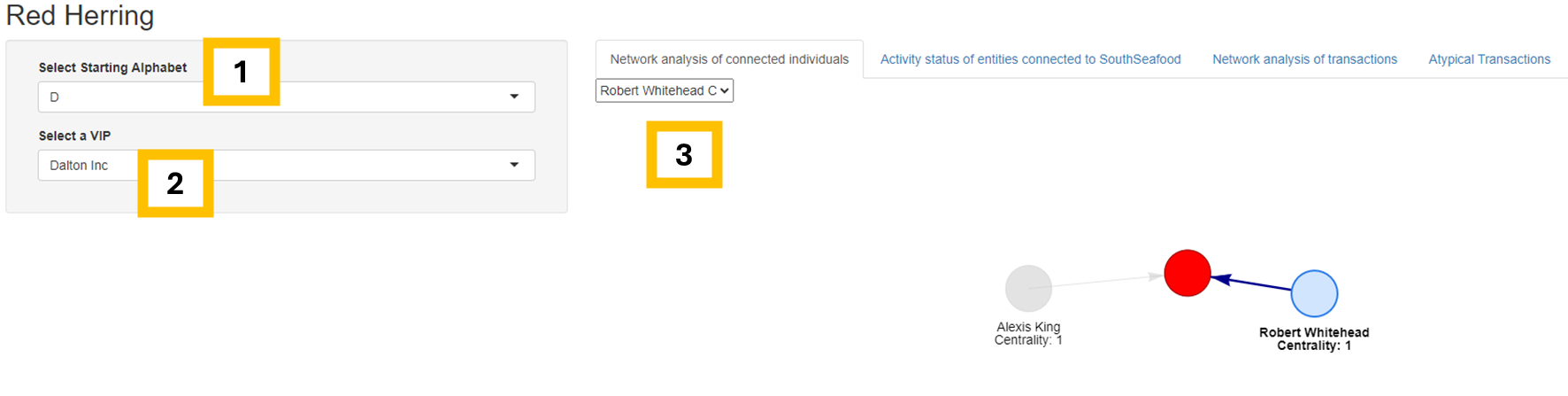
- To select a starting node (highlighted in red), first select corresponding starting alphabet of the node in the “Select Starting Alphabet” drop down.
- Then, select the node’s name under “Select a VIP”. The network plot will be shown.
- To more clearly a related node and its centrality value, you can select the relevant node of interest that is linked to the VIP (highlighted in red).
Below is an example showing Dalton Inc. as the node of interest, and their relationship with Robert Whitehead is being selected.
Activity Status of Entities Connected to SouthSeafood
This page shows the network of companies in Oceanus.
Above the plot, the following information is shown:
Total number of active companies (highlighted in green in the plot)
Total number of inactive companies (highlighted in grey in the plot)
Total number of companies with links to SouthSeafood Express Corp
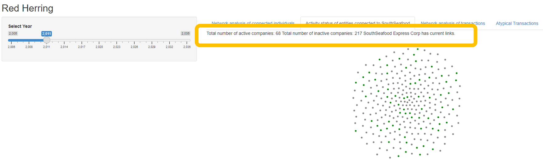
The network plot has the following functions:
Zoom (use mouse scroll)
Pan (click and drag to navigate around the plot)
Tooltip (hover using mouse)
- Shows name of node and number of links the node has
Highlight (left click using mouse)
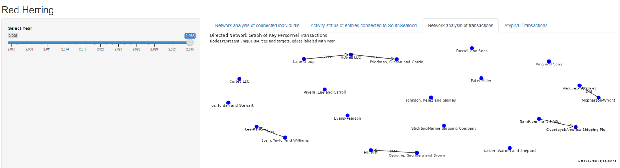
Network Analysis of Transactions
This page shows the directed network graph of key personnel transactions. The slider on the left is used to select the relevant years of interest. Each node (blue) represents unique companies, and each directed link is marked with the year the transaction occurred.
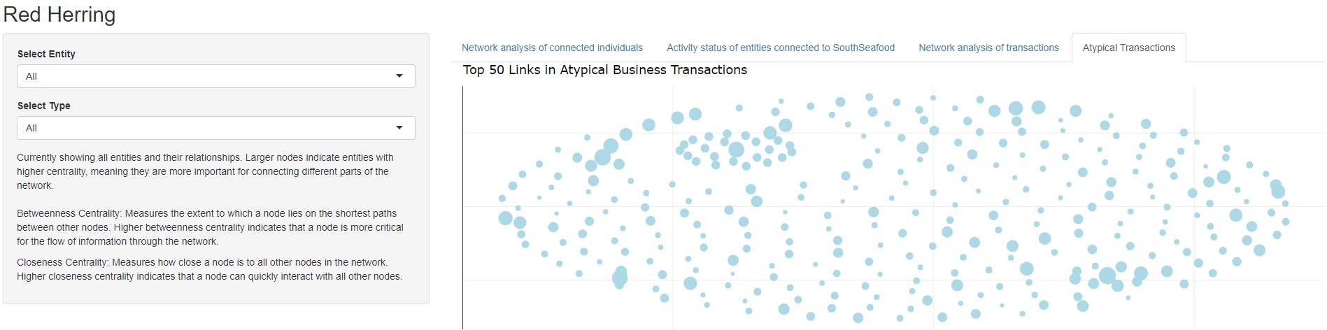
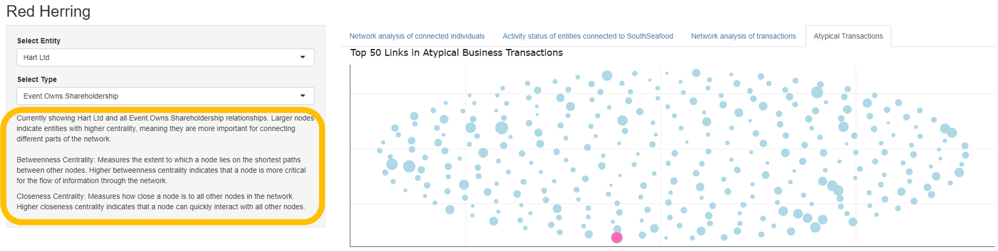
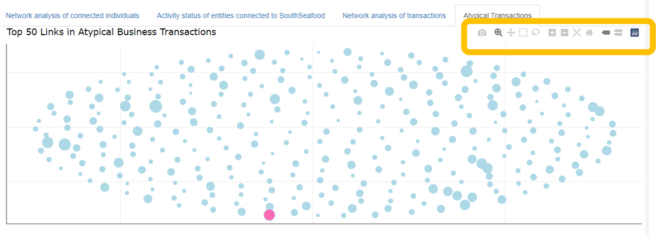
Atypical Transactions
In this page, transactions highlighted as atypical are visualised. Due to the volumne of transactions, only the top 50 are shown.
The start page shows all entities with all their relationships. The lager nodes indicate entities with higher centrality i.e. crucial to connecting different parts of the network. The distance between each node is also determined by their relevant centrality.
Using the drop down, you can specify the entity of interest (highlighted in pink), along with the type of relationship you want to hone in on:
Shareholder
Works for (Employee)
Beneficial Ownership
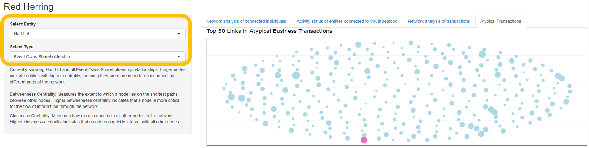
The options panel also offers more information concerning the plot:
Entity of interest being plotted
Relationship type being plotted
Explanation of node size
Definition of betweenness centrality
Definition of closeness centrality
To further interact with the centrality plot, hover over the top right hand corner to reveal plotly functions. Hovering over nodes will also reveal their ID and centrality scores.
Thank you for using our app! We hope you had an enjoyable experience!